A histogram is a commonly used graphical technique of presenting data that has been summarized using a frequency distribution. Data are grouped into "bins" or classes and the frequencies of these interval classes are represented by the height of each bar.
The following video provides an introduction to histograms:
The number of classes or "bins" is determined by the number of observations in the data we're analyzing. The greater the number of observations, the greater the number of classes or "bins".
The approximate number of classes or "bins" to use when constructing a histogram is defined below:
Number of Observations
|
Number of Classes (bins)
|
50 or less
|
5 - 7
|
51 - 200
|
7 - 9
|
201 - 500
|
9 - 10
|
501 - 1,000
|
10 - 11
|
1,001 - 5,000
|
11 - 13
|
5,001 - 50,000
|
13 - 17
|
Greater than 50,000
|
17 - 20
|
How do we determine the width of class intervals? We simply use the following formula:
Class width = (Largest Observation - Smallest Observation) / Number of Classes
Consider a data set with the following characteristics:
Largest Observation = 200
Smallest Observation = 48
Number of Observations = 250
Class Width would be calculated as follows:
200 (Largest Observation) - 48 (Smallest Observation) = 152 / 9 (Number of classes)
152 / 9 = 16.88 (Width of each class)
I generally recommend rounding the class widths to whole numbers, so in this case, each class would be approximately 17.
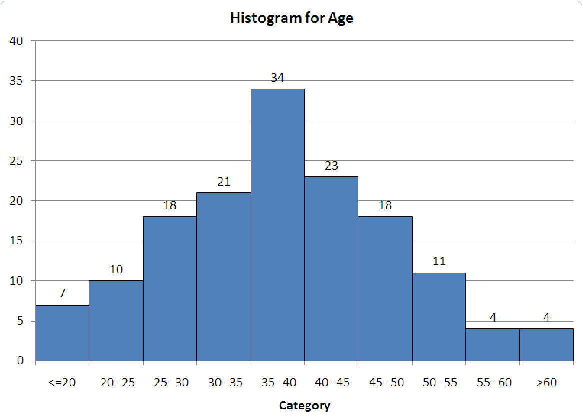
Histograms are generally defined by three shapes: Symmetric, Right-Skewed, and Left-Skewed
A symmetrically shaped histogram has an even distribution of data on each side of the mean, as the example below demonstrates:
When histograms are symmetrically-shaped, the mean and median are generally close together.
A right-skewed (positively skewed) histogram will have a mean (average)
greater
than the median. An example of a right-skewed histogram is below. Notice the "tail" of the histogram streaming to the right-hand side of the graph.

A Left-Skewed (negatively skewed) histogram is identified by the "tail" of data streaming to the left-hand side of the graph. When the histogram is left-hand skewed, the mean (average) will be
less than
the median. An example of a left-hand skewed histogram is below:

The following video will describe how to construct a histogram using MS Excel:
Your Assignment:
Part 1: The file below contains a list of the bankruptcy cases for public companies filed under Chapter 11 of the Bankruptcy Code opened and monitored for the fiscal period 2009-2011, as reported by the United States Securities and Exchange Commission.Generate adescriptive statistics tableof"Liabilities"reported for bankrupt firms during the reporting periodand create a histogram of this variable.
Public Company Bankruptcy Cases
 Download Public Company Bankruptcy Cases
Provide a thorough, meaningful, and relevant analysis (Statement of Interpretation) of the data and charts. Add and label additional worksheets in the file, as needed. Your written response should be recorded in the assignment comment box and titled, Part 1.
Part 2: Reseach a dataset that can be used to perform a statistical analysis. The data set should contain at least 50 observations to be analyzed. The following are suggested sources of datasets, but are not inclusive of all dataset sources.
U.S Census Bureau(Links to an external site.)
Federal Reserve Economic Data(Links to an external site.)
Center for Disease Control and Prevention, National Center for Health Statistics(Links to an external site.)
kaggle(Links to an external site.)(note: account registration required)
spotrac(Links to an external site.)
Generate adescriptive statistics tablefor the variable of your selectionand create a histogram of this variable.Provide a thorough, meaningful, and relevant analysis (Statement of Interpretation) of the data and charts. Your statement of interpretation must include a hyperlink to the source of your dataset. Add and label additional worksheets in the file, as needed. Your written response should be recorded in the assignment comment box and titled, Part 2.
Submit your completed MS Excel file in this folder for grading. (Note: Submit only one (1) file. Label all worksheets, as needed. For example, the file might include the following worksheets: Data1, Descriptive Statistics 1, Histogram 1, Data 2, Descriptive Statistic 2, Histogram 2.)