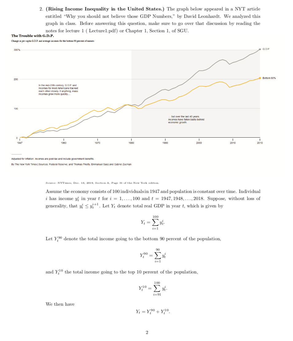
2. (Rising Income Inequality in the United States.) The graph below appeared in a NYT article entitled “Why you should not believe those GDP Numbers,” by David Leonhardt. We analyzed this graph in class. Before answering this question, make sure to go over that discussion by reading the notes for lecture 1 ( Lecture1.pdf) or Chapter 1, Section 1, of SGU.
Source: NYTimes, Dec. 16, 2019, Section A, Page 31 of the New York edition.
Assume the economy consists of 100 individuals in 1947 and population is constant over time. Individual
i has income yti in year t for i = 1,...,100 and t = 1947,1948,...,2018. Suppose, without loss of
generality, that yi ≤ yi+1 . Let Yt denote total real GDP in year t, which is given by tt
?100 Yt= yti.
i=1
Let Y 90 denote the total income going to the bottom 90 percent of the population, t
and Y 10 the total income going to the top 10 percent of the population, t
We then have
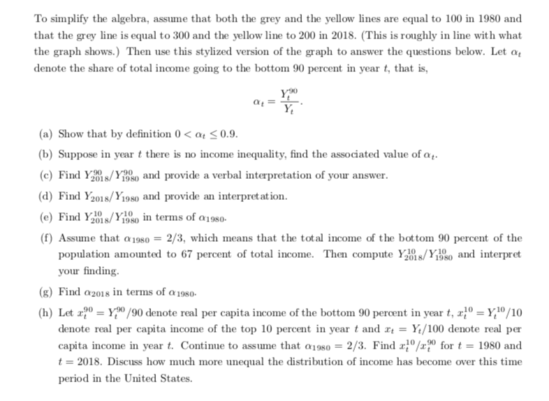
To simplify the algebra, assume that both the grey and the yellow lines are equal to 100 in 1980 and that the grey line is equal to 300 and the yellow line to 200 in 2018. (This is roughly in line with what the graph shows.) Then use this stylized version of the graph to answer the questions below. Let αt denote the share of total income going to the bottom 90 percent in year t, that is,
Y90 αt= t .
(a) Show that by definition 0 < αt="" ≤="">
(b) Suppose in year t there is no income inequality, find the associated value of αt.
(c) Find Y 90 /Y 90 and provide a verbal interpretation of your answer. 2018 1980
(d) Find Y2018/Y1980 and provide an interpretation.
(e) FindY10 /Y10 intermsofα .
2018 1980 1980
(f) Assume that α1980 = 2/3, which means that the total income of the bottom 90 percent of the
population amounted to 67 percent of total income. Then compute Y 10 /Y 10 and interpret 2018 1980
your finding.
(g) Find α2018 in terms of α1980.
(h) Let x90 = Y 90/90 denote real per capita income of the bottom 90 percent in year t, x10 = Y 10/10 tt tt
denote real per capita income of the top 10 percent in year t and xt = Yt/100 denote real per capita income in year t. Continue to assume that α1980 = 2/3. Find x10/x90 for t = 1980 and
tt
t = 2018. Discuss how much more unequal the distribution of income has become over this time period in the United States.

Extracted text: To simplify the algebra, assume that both the grey and the yellow lines are equal to 100 in 1980 and that the grey line is equal to 300 and the yellow line to 200 in 2018. (This is roughly in line with what the graph shows.) Then use this stylized version of the graph to answer the questions below. Let a, denote the share of total income going to the bottom 90 percent in year t, that is, (a) Show that by definition 0 < a4="">< 0.9.="" (b)="" suppose="" in="" year="" t="" there="" is="" no="" income="" inequality,="" find="" the="" associated="" value="" of="" a..="" (c)="" find="" ys/yeso="" and="" provide="" a="" verbal="" interpretation="" of="" your="" answer.="" (d)="" find="" y2018/y198o="" and="" provide="" an="" interpret="" at="" ion.="" (e)="" find="" ys/y1980="" in="" terms="" of="" a1980-="" (f)="" assume="" that="" a="" 1980="2/3," which="" means="" that="" the="" total="" income="" of="" the="" bot="" tom="" 90="" percent="" of="" the="" population="" amounted="" to="" 67="" percent="" of="" total="" income.="" then="" compute="" y1="" s/ye80="" and="" interpret="" y10="" your="" finding.="" (g)="" find="" a2018="" in="" terms="" of="" a1980-="" (h)="" let="" æ2º="Y,"" 90="" denote="" real="" per="" capita="" income="" of="" the="" bottom="" 90="" percent="" in="" year="" t,="" x}º="Y,º/10" denote="" real="" per="" capita="" income="" of="" the="" top="" 10="" percent="" in="" year="" t="" and="" r="Yt/100" denote="" real="" per="" capita="" income="" in="" year="" t.="" continue="" to="" assume="" that="" a198so="2/3." find="" r0/x0="" for="" t="1980" and="" t="2018." discuss="" how="" much="" more="" unequal="" the="" distribution="" of="" income="" has="" become="" over="" this="" time="" period="" in="" the="" united="">

Extracted text: 2. (Rising Income Inequality in the United States.) The graph below appeared in a NYT artide entitled "Why you should not believe those GDP Numbers," by David Leonhardt. We analyzed this graph in class. Before answering this question, make sure to go over that discussion by reading the notes for lecture 1 ( Lecturel.pdf) or Chapter 1, Section 1, of SGU. The Trouble with G.D.P. Change in per capita GDR and average incomes for the bottoe 90 percent of eames 300% GOP Bottom 90% 200 In the mid-20th century. GOP and Incomes for most Americans tracked cach other closely It anything, mass Incomes grew more quickly. 100 but over the ast 40 years. Incomes have tailen bady bohnd economic grouth. 1947 1960 1970 1980 1990 2000 2010 2018 Adusted for infation. Incomes are post-tar and include govemment benefts. By The Now York Times | Sources: Fodoral Reserve; and Thomas Pkotty, Emmanuel Sacz and Gabriel Zucman Source: NYTimes, Dec. 16, 2019, Section A, Page 31 of the New York edition. Assume the economy consists of 100 individualsin 1947 and population is constant over time. Individual i has income y, in year t for i = 1,..., 100 and t = 1947, 1948, ..., 2018. Suppose, without loss of generality, that y